Dallas Neighborhood Movement
Welcome to the Dallas Neighborhood Movement tool!
The neighborhoods where individuals grow up play a significant role in shaping their opportunities and long-term economic prospects. For children, these patterns are even more consequential. Raj Chetty’s research shows that children who move to higher-opportunity neighborhoods see meaningful long-term gains in income and upward mobility. Conversely, moving to lower-opportunity neighborhoods can have a lasting negative impact on their economic futures.
Using data from the Opportunity Insights team, CPAL has developed this tool to explore how neighborhood environments across Dallas County influence social and economic mobility. By tracking where children grew up and where their incomes ended up in 2015, we examine both the physical movement (which could be across neighborhoods, regions, or even out of state) and the corresponding economic outcomes. This tool helps identify which Dallas County neighborhoods are more likely to support upward social-economic mobility and which ones may hinder it, particularly in relation to where residents relocate. What we found in Dallas County tells a complex story. There are neighborhoods with high rates of mobility but persistently low incomes, as well as neighborhoods where higher mobility correlates with higher income outcomes. However, there are almost no neighborhoods where people experience both low mobility and high income gains over time. This points to a troubling reality: in most parts of Dallas County, individuals cannot meaningfully improve their economic standing while staying in the same neighborhood. If opportunity exists, it often requires moving to find it.
How to read this tool
Regional Income vs Mobility
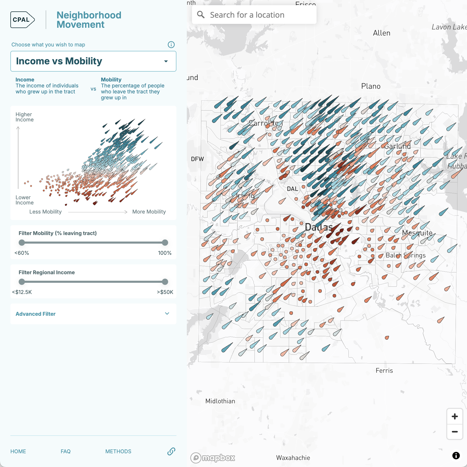
The Dallas Neighborhood Movement Tool is an interactive map that displays census tracts in Dallas County based on two key dimensions: mobility – the share of people in a neighborhood moved away from the region over time, and income – the 2015 income of individuals who grew up in the region.
Each census tract on the map is marked by a comet. The color of the comet represents the income of individuals who grew up in the tract.

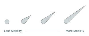
The length of the comet's tail reflects the level of movement out of the neighborhood.
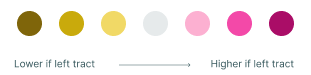
Income Change if Left Region
As a complement to assessing the key dimensions of mobility and income, we can look at how incomes differ with respect to mobility, for all those who grew up in the region vs just those who stayed in the region. To see this display select Income Change if Left Region layer from the upper left menu. You'll see the distribution of the tract along with the map.
2023 Household Income
In addition, we have provided the most current available 2023 Household Income data as the third layer in the upper left menu. This information enables users to gain a more current picture of how incomes have changed since 2015.

Tool Summary
Together, these design elements let users quickly see where similar neighborhood types cluster, highlighting patterns of the complex dynamics of economic mobility across Dallas County. The tool allows user to:
- Zoom in on neighborhoods to explore how opportunity varies block by block.
- Compare 1990–2015 mobility trends with 2023 demographic and economic data, helping contextualize how these places have changed over time.
- Ask deeper questions about the historical forces such as segregation, disinvestment, or infrastructure decisions that shaped the current map of opportunity in Dallas.
Implications of the tool
Establishing a data-driven collective understanding of where potential barriers or opportunities exist in neighborhoods can drive strategic action to promote economic opportunities. Historically, well-intended policies and investments have led to unintended consequences such as concentrating poverty in lower-income neighborhoods.
With the initial tool as a base line, CPAL plans to further deepen our understanding of neighborhood movement trends across the region. Our next steps include conducting qualitative interviews in high transition neighborhoods with a range of degree of mobility and opportunity to develop a more nuanced understanding of the changes over time. Learning from the experiences of residents, we will seek to find additional data to provide the necessary insight for data-driven action.
In the meantime, we are eager to hear feedback from community members, neighborhood leaders, operating partners and fellow practitioners in improving economic mobility outcomes. Contact analytics@cpal.org with your input, and we look forward to hearing from you.